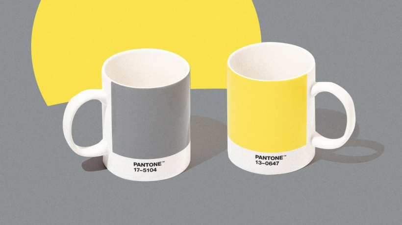
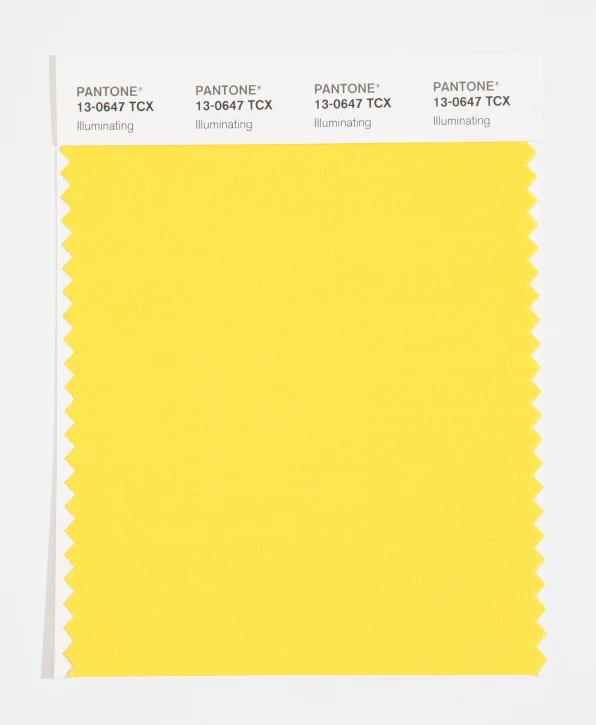
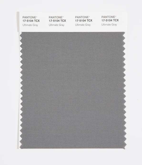
Following one of the bleakest years in memory, Pantone has announced its 2021 colour of the year. And it’s not one but two colors, designed to create the sensation of a fresh sunrise over rocky terrain. The colors are called Illuminating, a yellow that appears like the skin of a ripe lemon, and Ultimate Gray, which resembles wet cement.

Pantone’s Color of the Year choices are based on the Pantone Color Institute’s research into trends percolating across fashion, interior design, architecture, and art. These are colors you will likely see more of in the next 12 to 24 months because they are meant to define something intrinsic to the zeitgeist. “We always feel a responsibility to get it right,” says Leatrice Eiseman, executive director of the Pantone Color Institute.
Which is why in the past few years especially, Pantone’s picks have been imbued with social significance, serving as a snapshot of the global mood. Pantone’s 2020 selection was Classic Blue, a tame choice meant to counteract the existential anguish of autocratic leaders like Donald Trump and the mass propaganda behind them on platforms like Facebook. Pantone’s 2019 color was Living Coral, another color selected to provide reassurance in the face of rising authoritarianism.
Pantone’s 2021 symbology is almost too on the nose. After nearly a year of devastation due to COVID-19, viable vaccines are on the horizon. After the murders of George Floyd and Breonna Taylor in the US and the subsequent Black Lives Matter movement and other protests around the world, yellow is a symbol of optimism.
Pantone actually selected one color first and had settled on it as the color of the year months ago: Illuminating. But as the year progressed, Illuminating alone felt wrong to the team.’
“There was a day when [Eiseman] called me,” says Laurie Pressman, vice president of the Pantone Color Institute. “And she said, ‘You know, we’re giving this a rethink.’” So the team brought in the gray to form a two-color statement.
Alone, a gray would be stagnant and depressing, while a yellow would be overly ebullient. Together, Pantone argues, the pair is meant to be both optimistic and thoughtful.“[Illuminating] is definitely an aspirational colour, no question,” says Eiseman. “But I think with the solidity of the gray . . . when you juxtapose those colors against each other, the concept is clear, ‘Here’s what we’re hoping for. And this is the solid grounding to get us there.’”
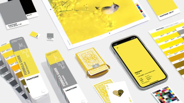
The symbolism of the colour of the year shouldn’t overshadow the business of colour forecasting. Illuminating is a color on the rise, having made a small splash at London Fashion Week in October. A similar yellow has been percolating at Off-White and Louis Vuitton under designer Virgil Abloh. Fans of the upcoming mega game Cyberpunk 2077 may notice that Illuminating is a stone’s throw from its defining electric-yellow cover art (which spawned a dozen promotional products of its own).
For the average homeware shopper, the Pantone team sees Illuminating as a pragmatic choice. Gray has been a mainstay across the world of design for at least a decade now, and with a splash of yellow, you can update your wardrobe or your dwelling without the complete makeover that most of us cannot currently afford.
“We have to acknowledge that gray has been around forever . . . if you think of it from a practical standpoint, how can we take a gray people are really comfortable with [and update it],” says Pressman. “[We’re] living in gray sweats! We’re not of a mindset, ‘That’s so yesteryear, throw it away.’ We’d rather engage on how to make that gray more fun. . . . and yellow answers that.”
______________________________________________________________________________________________________________________________________
Article originally appeared on fastcompany.com.