Language barriers are a major cause of the spread of fake news.
A senior physician in charge of the U.K.’s National Health Service anti-disinformation campaign has said that language and cultural barriers could be causing people from ethnic minorities to reject the COVID-19 vaccine. Dr. Harpreet Sood told the BBC it was “a big concern” and officials were working hard to reach different groups “to correct so much fake news.”
Some of the disinformation is religiously targeted with messages falsely claiming the vaccines contain animal produce like pork and beef which goes against the religious beliefs of Muslims and Hindus, respectively.
The issue of language is key because most warnings about misinformation online are in a written format. Take Facebook’s adoption of new alerts supported by independent fact-checkers, for example. They warn users of fake news and to try to prevent them from sharing it unknowingly. It is certainly a step in the right direction. But text warnings can be easily misunderstood and ignored. And that’s the problem.
Our research, which will be published later in the year, explores this issue and examines new, more visual, ways to warn users about potential misinformation. For our study, we manipulated a standard Facebook page design to develop 10 different visualization effects.
These effects can be categorized under color-based or “block” techniques where the text is essentially highlighted, blur effects that play with and alter the focus of the text, and pictorial-based techniques—like an image of shattered glass superimposed over the suspicious post. What was of real importance to us was how the image could be used to help people decide what is and isn’t misinformation.
A shattered-glass warning sign designed by researchers [Image: courtesy of the author]
In the physical world the design and use of warning signs is regulated by law and various standards must be followed. But online—and particularly in relation to misinformation—there are hardly any safety standards at all. So more attention needs to be given to the design of these warnings to support and motivate people to take more heed of the threat and its potential impact.
Our study with 550 adults found that people took more notice of warnings with assertive visuals highlighting the text, such as shattered glass or a block effect.
The block visual-effect warning [Image: courtesy of the author]
For many, the block effect clearly warned of impending danger, alarm, or misfortune. When we asked which visualization effect made people question the validity of what they were reading, the block visualization was more effective for men while the blur visualization worked better for women.
The blur effect [Image: courtesy of the author]
Interestingly, the blur effect raised participants’ suspicions and acted more like a caution, to afford careful and potentially more prudent behavior on Facebook.
LOOKING FOR CLUES
People are still hugely reliant on clues and weaknesses in the presentation of online content as ways to detect misinformation. For example, many participants told us they watch for things like bad spelling and grammar and flaws in the interface (like unprofessional designs) as ways to identify if something is not quite right. Unfortunately, in the age of sophisticated and convincing misinformation attacks, this technique might not be as successful as it once was.
The participants in our study felt they needed more help to cope with misinformation and many mentioned the need for bold signs and warnings. They wanted help to recognize that something is not right and so not to believe it.
Misinformation is clearly not going away. In 2020 a massive outbreak of disinformation about COVID-19 endangered lives and hampered the recovery. So it is more crucial than ever that people are given the right visual tools to find important and reliable information online.
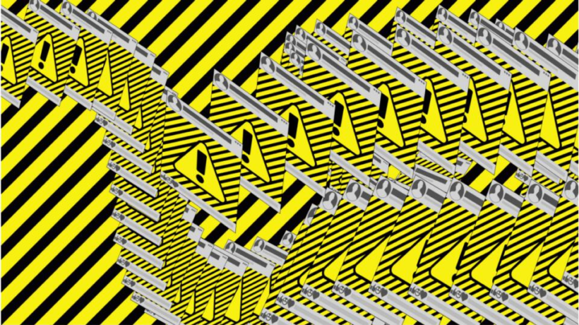
In the real world, there are bold signs that warn us of danger—whether it’s a red “no entry” sign on a road or an exclamation mark that shouts: “keep clear.” It’s time key players like Facebook, Google, and Twitter consider how a simple tweak to their designs might just help people spot danger online too.
Some of the disinformation is religiously targeted with messages falsely claiming the vaccines contain animal produce like pork and beef which goes against the religious beliefs of Muslims and Hindus, respectively.
The issue of language is key because most warnings about misinformation online are in a written format. Take Facebook’s adoption of new alerts supported by independent fact-checkers, for example. They warn users of fake news and to try to prevent them from sharing it unknowingly. It is certainly a step in the right direction. But text warnings can be easily misunderstood and ignored. And that’s the problem.
Our research, which will be published later in the year, explores this issue and examines new, more visual, ways to warn users about potential misinformation. For our study, we manipulated a standard Facebook page design to develop 10 different visualization effects.
These effects can be categorized under color-based or “block” techniques where the text is essentially highlighted, blur effects that play with and alter the focus of the text, and pictorial-based techniques—like an image of shattered glass superimposed over the suspicious post. What was of real importance to us was how the image could be used to help people decide what is and isn’t misinformation.
In the physical world the design and use of warning signs is regulated by law and various standards must be followed. But online—and particularly in relation to misinformation—there are hardly any safety standards at all. So more attention needs to be given to the design of these warnings to support and motivate people to take more heed of the threat and its potential impact.
Our study with 550 adults found that people took more notice of warnings with assertive visuals highlighting the text, such as shattered glass or a block effect.
For many, the block effect clearly warned of impending danger, alarm, or misfortune. When we asked which visualization effect made people question the validity of what they were reading, the block visualization was more effective for men while the blur visualization worked better for women.
Interestingly, the blur effect raised participants’ suspicions and acted more like a caution, to afford careful and potentially more prudent behavior on Facebook.
LOOKING FOR CLUES
People are still hugely reliant on clues and weaknesses in the presentation of online content as ways to detect misinformation. For example, many participants told us they watch for things like bad spelling and grammar and flaws in the interface (like unprofessional designs) as ways to identify if something is not quite right. Unfortunately, in the age of sophisticated and convincing misinformation attacks, this technique might not be as successful as it once was.
The participants in our study felt they needed more help to cope with misinformation and many mentioned the need for bold signs and warnings. They wanted help to recognize that something is not right and so not to believe it.
Misinformation is clearly not going away. In 2020 a massive outbreak of disinformation about COVID-19 endangered lives and hampered the recovery. So it is more crucial than ever that people are given the right visual tools to find important and reliable information online.
In the real world, there are bold signs that warn us of danger—whether it’s a red “no entry” sign on a road or an exclamation mark that shouts: “keep clear.” It’s time key players like Facebook, Google, and Twitter consider how a simple tweak to their designs might just help people spot danger online too.
____________________________________________________________________________________
Fiona Carroll is a senior lecturer in digital media and smart technologies at Cardiff Metropolitan University.
This article is republished from The Conversation under a Creative Commons license.