Jony Ive is a man who chooses his words carefully. Upon leaving Apple in 2019 to found his firm LoveFrom alongside Marc Newson, Ive’s first hire was a writer who could help articulate ideas before they were codified by drawing. Ive’s first website featured nothing but a statement. When collaborating with a client, sometimes LoveFrom will even produce a book.
It makes sense then that for the past four years, Ive and his cohort of 40-plus designers have been working with clients including Airbnb, Ferrari, and Moncler while fastidiously tweaking and perfecting a typeface—the object to present those words.
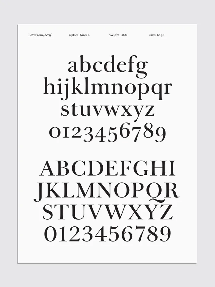
The typeface, LoveFrom Serif, has become an apt symbol to represent the firm’s raison d’être: namely, a devotion to craftsmanship, regardless of how protracted the process. LoveFrom built its foundation on the premise that the almost imperceptible intricacies that make a designed object great can elevate our world to a place where things feel more than beautiful—they feel necessary—and by getting more designers with different disciplines working together on these projects, they can move the needle forward across the field as a whole.

It’s a notion that could be perceived as navel-gazing but right now feels more urgent than ever, as culture enters an era when the idea of craft itself seems endangered by an onslaught of generative artificial intelligence.
LoveFrom Serif was created by much of the same design team behind Apple’s San Francisco (the font you see across your iPhone, Apple Watch, and MacOS). The typeface debuted in LoveFrom’s logo (a wordmark reading “LoveFrom,”). Later it appeared in a Terra Carta seal and charter made for the advancement of design education. It subsequently showed up in the emblem for the coronation of King Charles III, and most recently in both the headline and body copy of Make Something Wonderful, a book of collected speeches, interviews, and correspondences, all in Steve Jobs’s own words.

It’s a technical masterpiece that, frankly, makes you wonder why it has occupied so much of the brain space of this generation’s best design minds. But as Ive sees it, his studio is here to do exactly this sort of work.
“This is a huge effort that makes no economic sense. It makes no business sense,” Ive says. “The only sense, the only way you can resolve why we’re doing this, is because we think it’s important and we care. And do we care for us? No, we actually believe that it’s a service to culture.”
Giving LoveFrom form
Peter Saville was flattered to have gotten the call.
When Ive and Newson were forming their studio, they knew they wanted the name to be LoveFrom—a message that captures the spirit of a written letter. But how should the word look?
Alongside Chris Wilson (the former head of UI design at Apple), he posed the question to Saville, a landmark graphic designer most frequently cited for his work creating the Joy Division Unknown Pleasures album cover—which was actually his very first project before an award-winning career that spanned his own music label, brands like Lacoste, and collaborations with Christian Dior, Stella McCartney, and Raf Simons. Saville’s concern was love, “mainly because of the familiarity of the word,” he explains. “There are only so many things you can do with it. It was actually very difficult to find a new way to see the word.”
Ultimately, Saville’s suggestion was deceptively simple: Add a comma at the end of LoveFrom. He notes that the comma offered an intangible counterbalance to the word love. “It gave [the name] some sincerity,” he says. Commas are also rare in logotype, so it was surprising. LoveFrom wanted a relationship with the audience, and it implied a dialogue. The logo is, quite literally, frozen in a perpetual state of being about to say more.
“[We] thought that the comma was a beautiful device, one that really speaks to not a statement but asking a question,” Ive says. “And it’s about the beginning.”
With the name decided, the remaining inquiry was which typeface LoveFrom should be set in. Saville assumed the answer was a sleek, sans serif font (think Helvetica, or Apple’s San Francisco), “the kind of font you associate with Jony Ive,” Saville says bluntly. “But he decided, in his way, to push it on from that.”
Serifs (think Times New Roman) became the focus instead, and after an exhaustive search, LoveFrom designer Antonio Cavedoni landed on Baskerville as a source of inspiration. The typeface is one everyone has seen, so it would be quietly familiar, even timeless. But it has enough expressive components that it could live in many contexts. Just as great of an appeal was the historical context of John Baskerville himself.
“John Baskerville as a person, as a craftsperson, was uncannily similar in his obsessiveness and his character to those of us at LoveFrom,” Ive says. “And that really, in a very natural way, became the starting point for developing our own typeface.”
Building Baskerville
Baskerville was indeed obsessive, Cavedoni explains. As we wrote in our story on the Terra Carta, Baskerville first made his money in “japanned” lacquerwork items. As he reached his 40s, he had the resources to go heads-down on his passion for word-making. As a trained calligrapher, he wanted to elevate the quality of book printing. He obsessed over not just the design of his typeface Baskerville but of the crafted execution of the individual metal “punches” that pressed each letter to ensure the printing was sharp. He even formulated an improved ink, and learned he could place woven paper into hot brass cylinders to give it a glossy finish.
Cavedoni began studying Baskerville’s printings and other typefaces and writing manuals from the 1700s. And then he had what he calls “a breakthrough.” He found that Baskerville’s original punches had been preserved in careful, macro photography by researcher Robin Hull. That meant rather than solely analyzing a print, which is naturally imperfect from the bleed of ink on paper, LoveFrom could go straight to the source: the metal forms Baskerville had created to print books. (The team observed these punches in person at the University of Cambridge.)
Cavedoni cross-referenced and redrew the letterforms both digitally and on paper, slowly piecing together the LoveFrom logo, balancing it letter by letter, taking liberty as he went to refine the forms. For instance, Baskerville capitals are big, dark, and weighty, creating awkward chunks of negative space. Cavedoni shaved and sharpened the forms, tapering the serifs and thinning out their thick stems (the tree trunks of the letters).
“We sort of tamed a lot of that complexity, and I don’t want to call it unruliness, but it’s something like that,” Cavedoni says.
Of course by the time that was done, the team already knew what they wanted to do next: build the full typeface—the complete alphabet of letters, upper and lowercase, with numbers, special characters, and variable widths to be discernible at different sizes.
Alongside Riccardo Lorusso (who also worked at Apple on the San Francisco font), Cavedoni painstakingly redrew Baskerville into LoveFrom Serif—not as a literal re-creation but as an evolution of form. Then they began experimenting with different weights, squeezing it thin and widening it into an ultra bold in ways Baskerville never considered.
The italic version in particular is lovely to behold. Cavedoni added some extra speed to it from the Baskerville standard (giving it more slant), and made the lines more fluid. Look at those serifs on the top of the b, d, and h—it’s like the top of the convertible is down and their hair is being blown back.
Minimal? Not at all. The majuscules (capital letters) have ultra-sumptuous ball terminals (look at the capital K) that almost drip in front of your eyes. The minuscules (small letters) feel handwritten with their thin entry strokes, but the perfectly resolved rounded terminals on the bottom of the m and n demonstrate there’s no way they could have been created by hand with a pen. They appear machined.
“I think it’s as close to perfection as you can get,” says Ive, who confessed that he keeps a print of the italics at his desk.
This serif is essentially the voice of LoveFrom, or its working hand. When LoveFrom creates a typographical project—like the King Charles III seal—it will write it in the serif. But because the weights and styles of the typeface give it flexibility, that opens the door for how it can match the identity for clients, or, as Ive calls them, “friends.” Case in point: The team developed a LoveFrom serif condensed bold variant strictly for use on the Steve Jobs Archive site.
“That voice felt like something that would be timeless for LoveFrom, but also flex into the massively broad range of projects that we do,” Wilson says. “Whether it’s purely industrial design, whether it’s branding projects, whether it’s projects that are in fashion, or in the environment . . . [we wanted something] that could flex across all of those in a really inconspicuous way.”
Perfecting the curves
Ive has been on a career-long quest to produce products with “curvature continuity.” Most human-made rounded objects are ostensibly rectangles with curved edges added later. And when produced carelessly, you can actually see the break between the line and the curve. (The team demonstrates this for me with a 3D model that appears to have a perfect corner but splits the reflection at its joint.)
“I would suggest—and without speaking for Jony, I know he agrees—there is a right and wrong way,” Newson says. “There’s not much in the middle.”
Apple products—much like the bodies of cars—feature continuous curves. Their forms have smooth transitions, as micron-level differences can distort reflection or even be felt by your hand. Technically speaking, continuous curvature requires both using the right mathematical functions to draw curves and also examining the sculpt of an object on the whole rather than considering a single corner or plane as distinct elements.
“Maybe this sounds controversial, but it’s a question of taste,” Newson says of the firm’s fixation on the aesthetic. “To us it’s the difference between something mediocre and something not only good but adequate.”
Even when you can’t cognitively distinguish these curves with your eye, you can often sense their resolve or lack thereof. It’s why Ive went so far at Apple as to have the interface team redraw Apple’s own app icons with a more continuous shape.

“Nothing would ever leave the studio without having continuous curves on it,” Wilson notes.
But whereas curvature continuity is a standard in high-end product design, it’s nearly impossible to achieve with type. Part of the issue is diminishing returns. Something that’s 1 millimeter tall, rasterized in a limited number of pixels, won’t have true curve continuity on a screen anyway.
While Cavedoni can craft individual letters to appear continuous, you could think of designing an alphabet as designing 26 separate products before different cases or special characters. And that’s at one size, in one variation, in two dimensions. No imaginable level of human labor could solve the issue at scale.
Enter Patch Kessler, an ex-Apple engineer who helped create the company’s high-tech developments like Force Touch who has since migrated to LoveFrom. A mathematical expert, Kessler created a tool that can analyze vector outlines and render them as continuous curves at any scale. And so without redrawing anything, LoveFrom serifs can translate across size and medium more automatically, without breaks in the form.
The typeface is a clear extension of Ive and Newson’s industrial design sensibilities, and is illustrative of the studio’s approach to nearly every project it takes on. “I think that’s one of the symbolic things around Jony’s vision for LoveFrom being a multidisciplinary studio, where expertise from one expertise can inform another,” Wilson says. It happens that in this case, the industrial design practice informed its graphic design practice. But development could and will also happen the other way around, Wilson notes.
Love and Fury
It would be entirely fair to call LoveFrom’s obsessive approach to its serif as ouroboric—a process that goes so deeply into itself that it will always create its own new problem. As Ive holds up the initials SJ set into monumental bronze, he teases how much more complicated the serif becomes when considering its existence in the 3D world.
“What’s lovely is because we develop this for ourselves, I don’t think we’ll ever be done,” Ive says with a self-aware smile.
In this sense, LoveFrom Serif is more than a product. It’s the first example of what the studio really seems to be after: not simply the absolute peak of craft, but something of a Grand Unifying Theory of Design. Much like physicists are working to resolve how the smallest particles in our universe work alongside the largest bodies, LoveFrom is taking its time to pursue formerly unrecognized connections across design to realize new forms of perfection.
“There are empirical shapes, and empirical proportions, which are simply more pleasing to the eye,” Newson says. “And that could be really well demonstrated within a font. And it is also beautifully demonstrated in the Parthenon, for example.”
Consider that six months ago, the atomic bomb of AI generators fell upon all of us, promising to automate the process of writing, design, and art. At best, the youngest generations among us will be working with a boxed cake mix of creativity—quick, easy, and on rails. At worst, we will lose deep expertise of the fields we hold most dear as masters of craft go extinct.
LoveFrom in 2023 reminds me of Chanel in the 1980s, which as textile craftsmanship was being lost to industrial garments systematically acquired dozens of artisan workshops it left mostly untouched to protect the execution of craft into the future. By 1997, Chanel would spin off a subsidiary of these workshops under the name Paraffection, which translates to “for the love of”—a verbal parallel that feels too strong to ignore.
“It really is for the love of doing something and doing it well,” Ive says. “That’s the reason we’re doing this.”
Words matter to Jony Ive. Go to LoveFrom’s website and scroll all the way to the bottom. There you won’t see the friendly “LoveFrom,” but a more disquieting juxtaposition: “love & fury.”

“The fury word unsettled me a little,” Saville concedes. “But I think really they just meant ‘devotion’ and ‘intensity.’ I think the argument was to have a word that was challenging. Love is, I think, quite self-evident. And I think by fury, they mean that we really mean it.”